NYC Taxi Fare Prediction - Kaggle Competition
The New York City Taxi Fare Prediction Competition was a Kaggle competition ran back in 2018, 3 years from the time of writing this post. As such, the Kaggle competition is closed for submissions that count towards the leaderboard, but I really enjoy looking at this competition as an introduction to Kaggle and machine learning competitions in general. The dataset is very approachable for a beginner with a small number of features, however it has a large number of observations (individual taxi rides) which introduces new competitors to challenges involving time complexity and how much data should actually be loaded.
In this post I am going to run through one possible submission for this competition, explaining each step in a way that hopefully introduces readers to the world of machine learning competitions and each step in the process building up to a final submission.
The full code for this is on github provided in both a notebook and flat python file form. You can also find it as a notebook on Kaggle if you want to edit and run it quickly.
Part 1 - Examine and clean the data
The competition provides us with three files - train.csv, test.csv, and sample_submission.csv. The final sample submission file simply shows us the format to structure our final submission in and is not so important to understand initially.
|
|
- train.csv has a shape of (55423856, 8) meaning we have roughly 55.4 million observations (individual taxi fares) and 8 features for each of those observations. Our features are columns, while our observations are rows. This is a lot of individual fares! We’ve loaded in the first 2 million rows.
- test.csv is significantly smaller with a shape of (9914, 7). Note we have one less feature (column) than the train data - this is because fare_amount is removed from this data as it’s the data we want to predict the fare for!
Let’s look at the features of this data. As mentioned there are 8 in train.csv. These features are:
- key - the key represents the pickup date and time in local time (NYC)
- fare_amount - a USD value to two decimal places representing the cost of the trip, tolls included
- pickup_datetime - the pickup date and time for the specific trip in UTC format
- pickup_longitude - the pickup longitude position, presumably from an on-board GPS
- pickup_latitude - the pickup latitude position
- dropoff_longitude - the dropoff longitude position
- dropoff_latitude - the dropoff latitude position
- passenger_count - an integer value representing the number of passengers in the taxi
One of the great things about having over 55.4 million observations is that we can be quite aggressive in how we deal with missing/nonsensical data. One of the big challenges in dealing with missing data can be deciding whether we drop it completely or interpolate the missing values using a method such as mean imputation. With so many observations it is unlikely that simply dropping this data is going to have any effect our model at all. Before we look at missing values in this data, let’s generate some summary statistics for the values in the columns above using pandas.
|
|
This gives us a nice table which essentially generates some simple summary statistics for us to look over. If there is one thing that I want to really have sink in as you read this, it’s that the best way to do EDA (and honestly, the best way to critically analyse results in general), at least initially, is by doing a sanity check. On an approachable dataset like this, we can straight away identify a lot of issues simply from the summary table above.
Taking the very first column in the table, we can see that it describes the fare_amount for each observation. The maximum value across the data we have loaded is 1273.31, and the minimum value is -62. From a sanity point of view, does this make any sense? Perhaps a maximum fare of USD$1200 is possible for an extremely long trip, and this particular data point could be cross-referenced with the other features to confirm whether it is legitimate or not, but it’s unlikely to be legitimate, and looking further at this point, the distance of the trip was 0km (more on how we calculate this later), so it is not a legitimate observation. How about a negative taxi fare? Clearly it makes no sense, so we definitely want to put some constraints on the fare.
We also want to have a quick initial look at the passenger_count column. Again, this should be very intuitive and should be easy with a simple sanity check. The minimum value is zero, and the maximum is 208. I’m not sure what sort of taxis exist in NYC, but I’m betting there isn’t one that holds 208 passengers! The mean is 1.6 passengers per trip which makes a lot more sense. When cleaning this column we want to exclude all with a passenger_count of zero as it doesn’t make much sense to be charging for a trip with no passengers, and we’ll put a generous upper limit on the amount of passengers as well at 6.
|
|
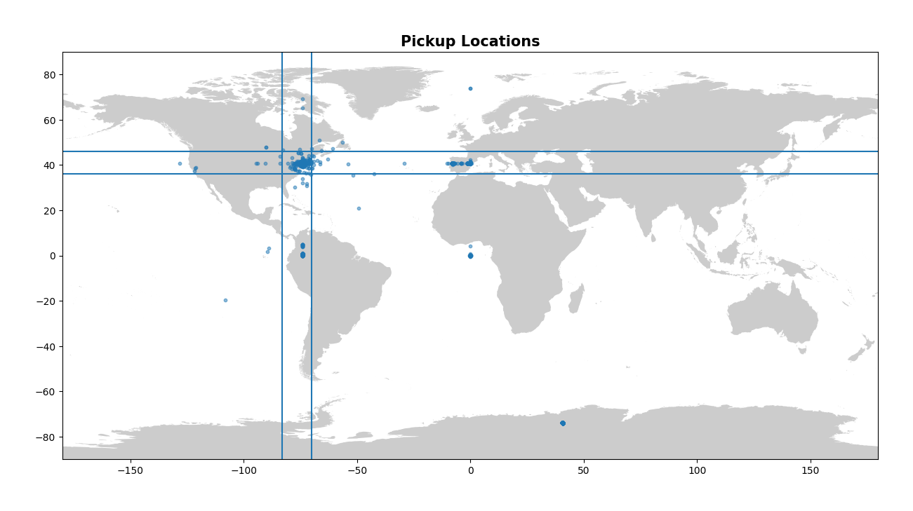
The next columns to inspect in the table describe the longitude and latitude for both pickup and dropoff. Now remember that this is a dataset for New York City taxis, so we want either the pickup or the dropoff location to be located within NYC, or at the very least NY state. A useful way to look for values that make no sense with geographic data is to plot them, so let’s plot both the pickup and dropoff locations on a map. Note that when we create these plots we are using a local shapefile for the map and we use the package GeoPandas to create a dataframe containing our points. There are many ways to visualise this and this is only one way - I would encourage the learner to explore both ends of the spectrum, from simple plots using matplotlib to complex interactive plots using plotly! I’ve also drawn four straight lines on each plot to very roughly represent a bounding box in which all our points should be contained.
|
|
|
|

Now this is a nice visual look at our pickup and dropoff data. It makes it abundantly clear that there is some issues! There’s points all over the globe, from Antarctica to France, to a clustering at Null Island (0, 0). Constraining the latitude and longitude to drop all values outside of NY will be important in cleaning up our data here. Let’s clean up the longitude and latitude values now.
Here we simply drop all values that have a longitude and latitude outside the bounds that we define. Note that this isn’t perfect as you will see in the later images, but it removes the majority of the outliers.
|
|
Let’s quickly confirm that the minimum and maximum latitude and longitude now makes sense for both the pickup and dropoff columns.
|
|
We can also confirm that we’ve dropped the NaN values by repeating the previous line:
|
|
Great, there’s no NaN values in our data and the summary statistics look a lot better. Before looking at our cleaned visualisations of the pickup and dropoff location data, we can take a look at the final shape of our train data after cleaning.
|
|
From the initial 2 million observations that we loaded from the train data, we now have 1.95 million. This means we’ve dropped around 50,000 observations or only 2.5% of our total - not bad at all. This supports what we mentioned earlier about being able to be aggressive in the way that we drop data - we aren’t having any significant impact on our model at all, at least not to the level that we would be with a far smaller dataset.
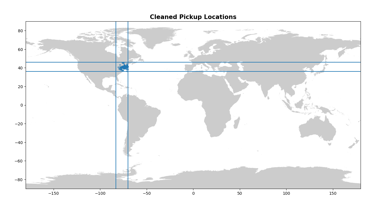
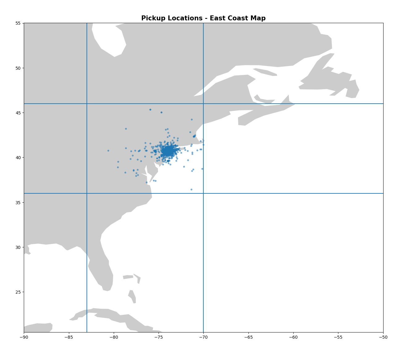
Now let’s look at our latitude/longitude values. Again, visually is the best way to do this, and so we can create the same plots as last time and confirm that we’ve indeed dropped our outliers.
|
|
|
|

|
|
|
|

These plots look much better! I enjoy looking at the final map of NYC as well - you can clearly see the shape of the city and bridges mapped out by the numerous pickups!
Now we move on to one of the columns that we haven’t looked at much yet - the pickup_datetime column. As we explained earlier it contains the date and time of the fare. However to get this into a format that Python understands we need to use the to_datetime call in Pandas. This is simple to do and we will do this for both our train and test data. This is preparing the datetime data for our next step - feature selection!
|
|
Part 2 - New Features
Now we’ve cleaned up the existing features we can look at creating new features. I keep referring back to this, but when creating new features it’s great to do a sanity check. Given some common knowledge about a taxi business, what might be interesting as a feature that could improve our model? How about the day of the week? The hour at which you order a taxi? Do you think the fare would change ordering a taxi at 4pm as opposed to ordering one at 4am? In total we’re going to add six new features here, all from the datetime column that we previously worked with. These six features will be the hour, the day of the week, the day of the month, the week of the year, the month of the year, and the year.
|
|
Great, we’ve created six new features based on our datetime object. Thinking again for new features - how about the distance of the trip? It’s one of the most defining factors in determining the price for a taxi trip, and anyone who has sat in a taxi has seen the meter keep ticking over the further the trip goes on. We’ve got the pickup and dropoff coordinates, but we don’t have an actual distance. Luckily, we can use the great circle distance (the distance between two points on the surface of the Earth) to calculate this. This is also referred to as the haversine distance.
Now we simply define the haversine function and then call it for both our train and test sets. Now we have a new feature - distance_km!
|
|
What other features can we look at adding? Well, we’ve added the distance from point A to point B of a trip. However, what if some trips have a fixed price? One of the common areas for taxi trips is to and from the airport, and New York has three major airports - JFK, EWR, and LGA. We can add new features to calculate the pickup and dropoff distance from all three major airports in the NY area.
|
|
The final change we will make is converting the original four pickup and dropoff coordinate columns from degrees to radians. Why do we do this? There’s a great article here explaining why, the summary of which is that radians make far more sense than degrees for a model to interpret.
Now we’ve created all these new features, let’s take a look at them visually and see what they can tell us about our data.
First, let’s take a look at the distance of our trip and see how the fare amount varies with increasing distance.
|
|

This plot is very interesting. We can see a very high concentration of trips between 0 and 40km in distance, and the fare for these trips seems to follow a relatively linear relationship - as the distance increases, so does the fare. However, this isn’t the case for every trip visualised on this plot.
Something that could potentially improve this model is dropping trips above a certain distance. A trip above even 100km in a taxi would be incredibly rare in practice, and the fares certainly don’t make a lot of sense for these trips. As an example, on this plot, at the 150km distance, most of these trips cost less than $50! This isn’t realistic and really fails a logical check, so we could potentially improve our model by dropping these odd trips from our train data.
Next let’s look at the passenger count and how it affects the price, as well as the distribution of the passenger count in each trip.
|
|


We can see there isn’t a significant relationship between passenger count and price. This is further apparent when we look at the distribution of passengers across all trips - the vast majority of trips have only one passenger on board.
We will now look at the hour of each trip and how this affects the fare price.
|
|


We can see the highest median fare price comes in at 4am, and this makes a lot of sense. At such an early hour there is unlikely to be many customers looking for a taxi, and as such fares are increased. As we move into peak hours and during the day, the median fare price drops dramatically. It is between the hours of 10pm and 5am that the median fare price is higher.
This assumption is supported by our bar plot as well. The amount of trips is at a minimum at 5am, and starts to drop off at around 10pm. Less trips in the evening and early hours of the morning, leading to higher fares during those hours. Interesting to note is that the busiest hour is 7pm, likely a combination of some people returning home from work, and others on their way out for dinner.
We’ll now look at the day of the week and how this affects the fare price, as well as the number of trips per day.
|
|


It’s interesting to see that there isn’t much of a relationship here. The fare amount remains constant except on a Monday, where the median fare is 40 cents lower than the rest of the days. The distribution of trips per day of the week doesn’t show any significant variation either - Monday has the lowest amount of trips, but not by a significant margin. Friday has the most trips which makes some sense, a combination of people still going to and from work (unlike on weekends), but also has the added spike of trips for people going out for dinner on the Friday evening.
We can now look at the week of the year and see how this might affect our fare price.
|
|


The first thing you might notice here is that there’s 53 weeks on these figures! This is because the year 2012 was a year with 53 weeks, a phenomenon that occurs every 5-6 years. Our data includes the years 2009-2015.
It is interesting to note that the number of trips is significantly higher in the first 26 weeks of the year, at which point we see a significant decline in week 27, and then a steady trend for the remainder of the year. The number of trips also drops off significantly in the final weeks of the year (51 and 52), likely due to Christmas and New Year celebrations. There isn’t any other significant variation in the number of trips per week except in week 53, as there is only one week 53 in our data of 2009-2015.
We will now look at how the fare price changes through the months of the year.
|
|


These plots are similar to our previous ones where we investigated the weeks of the year, but instead now we are looking at a different level of abstraction. The highest median fare amount occurs in December, and then a significant drop occurs to the lowest median fare amount in January. July and August also see a large dip in the median fare. When we look at our next plot of the number of trips, we can see the least amount of trips occur in July and August.
Other than these small variations there isn’t anything significant to point out one month being far busier than any other.
We will now move to the highest level of abstraction that we have - the year feature.
|
|


It’s interesting to see that the median fare sees no change in 2009, 2010, and 2011, but in 2012 we see a relatively sharp increase of $0.75 in the median fare, and in 2013 we see an increase of $1.00. The median fare then remains the same through 2013, 2014, and 2015.
The number of trips per year doesn’t provide much insight into this, as it remains relatively steady with only mild fluctiations in the number of trips per year. The drop in 2015 is not important as we previously mentioned that this dataset simply doesn’t contain data for the entirety of 2015.
This is our visualisation complete. It’s always important to note that this is just a basic overview of each feature - you could go far further into depth with these, especially with the maps of NYC above. I would encourage any learners to take advantage of the ability to create interactive maps using Bokeh and other packages which can help visualise the trips in the state in an even better way.
In this section we introduced new features to our dataset which we are hoping will improve the accuracy of our model. Now it’s time to actually create our model and put that theory to the test.
Part 3 - Model Training
Now that we’ve done our preliminary data cleaning and feature selection, let’s look at creating multiple models that will allow us to predict the fare amount on our test data for the competition.
The first thing that I always like to do is look at the columns in the train and test data. We’ve added a number of new features to our data so it’s important to verify one last time that all the columns are as we expect before we begin to create a model.
|
|
We can see above that all the columns are correct. Note the absence of the fare amount column in the test data, as this is what we are trying to predict. Other than that, the datasets have the same columns. We’ve also defined the features we want to use in our model, ignoring the key and the fare amount in the train data.
For this notebook I’m only going to show one approach, using a package called Optuna.
Optuna is a package that will allow us to tune the hyperparameters of an XGBoost model by providing a set of hyperparameters to iterate through. It’s efficient and far faster than other methods such as GridSearchCV which I haven’t demonstrated here.
The first thing we do is define our objective function, specifying our train data and our train target. We then use train_test_split to split our train data into multiple sets, and then we define our hyperparameter grid, just as we would with any other hyperparameter searching package.
We then create an XGB Regression model which we will use to run through our hyperparameter grid.
|
|
Now we create an Optuna study with 20 trials. We also generate some visualisations which will appear in the local notebook environment. To have these plots display in the browser instead (if running on a local jupyter kernel), add renderer=“browser” in the show method.
|
|
Now that we have obtained the best hyperparameters from our grid, we create a final XGB Regressor with these parameters and then fit the new model to our train data once again. We then make predictions on the provided test data and export these predictions as a CSV file.
|
|
One final visualisation we generate is the feature importances for each feature in the model - note that this is different from the Optuna feature importance which is for the importance of each hyperparameter, not each feature in the model.
|
|

This simple submission using one model and hyperparameter tuning using Optuna gives a top 10% ranking in the competition. To further improve I would encourage the reader to think about the following topics:
- Data cleaning thoroughly, i.e. dropping outliers in a more accurate way than simply just chopping at a given latitude and longitude
- Further feature selection, either through dropping features that aren’t significant and creating further new features that may help model performance
- Multiple models (LGBM/RF are good starters), varied hyperparameter grids, and model ensembling
That’s everything for this notebook. I hope you’ve been able to learn something and if you have any feedback feel free to get in touch.